Snapshots-tutorials will no longer be updated.
I have moved to my own domain and webspace.
You can find my new website at http://stumbl.be.
Some of the tutorials here will be moved to my new site, and all new tutorials will be posted there as well.
Hope to see you there!
- Matt
Sunday, July 29, 2007
Moved to stumbl.be
Posted by
THC
at
5:15 AM
7
comments
![]()
Labels: icons, illustrator, online, photoshop, templates, wallpaper
Sunday, July 01, 2007
Sunday, June 24, 2007
Make a stylish search icon
- Open a new file of 512x512px. Fill it with black.
- set your foreground colour to #3877BD
- Select the Ellipse Tool and draw out a circle of 250x250px and position it as shown below:
- Select the Rectangle Tool and draw out a rectangle of 100x350px. go to Edit > Transform path and rotate it by 45°
- Place it as shown in the screenshot:
- While holding down Ctrl - click on both layers in the layer window.
- Right-click and select 'Merge layers'
- Next - go to Layer > Layer Style and add a white inside border of 15px
- In the layer style window - go to Inner glow and apply the following changes:
Colour used for the Inner Glow is #1e2732
- Go to Outer Glow and apply the following settings:
Outer Glow colour is black (#000000)
This is what you should have so far:
- Get the Elliptical Marquee Tool out and create a circle of 170x170px.
You can set this value in the toolbar:
- Position this selection in the center of the magnifying glass. (Use the arrow keys on your keyboard to nudge the selection left, right, up or down.)
- Fill it with white
- Right-click inside this selection and select 'Layer via Copy'.
- Add a white outside stroke of 5px to this copied layer.
- Create a new layer and select a Soft Mechanical Brush of 100px (you can find this brush in the 'Basic Brushes' set)
- Make sure your foreground colour is set to white and click once somewhere on your new layer.
- Position it as shown below:
- Select the magnifying glass layer again - and click with the Magic Wand inside it.
- Go back to the brush layer and go to Select > Inverse.
- Press Delete
- Delete the background, merge the layers, resize it to an appropriate size and you're done.
The result in different sizes:
Posted by
THC
at
2:28 AM
2
comments
![]()
Labels: photoshop
Saturday, June 16, 2007
TutorialSearch - tutorial Searchengine

I'm happy to announce that I just created a search engine with the help of Google Coop, that will (hopefully) make searching for tutorials more easy.
The searchengine - called "TutorialSearch" - can be found here and will search all popular tutorial indexing sites. So far these indexing sites are 'Good-Tutorials', 'Pixel2Life' and 'Tutorialized.'
If you think that there are others I could add sent me an email or leave a comment here.
I hope TutorialSearch will be of good use to you =]
Posted by
THC
at
9:14 AM
0
comments
![]()
Labels: online
Monday, May 28, 2007
A DeviantArt styled vector wallpaper
- Open up a new file of 1024x768px and fill it with #849686
- Select the gradient tool and apply a reflected gradient (foreground to transparent)from the center of the canvas to the bottom or top with #61726f as the color.
- Create a new layer, set your foreground color to #edf5f3 and select the Ellipse shape tool and make a circle of 300x300px
- Go to layer > layer style anbd apply a border of 10px (color= #43534d)
- This is what it should look by now (image resized):
- Go back to layer > layer style and change the following settings:
color used for inner glow #bbc2bb
- Create a new layer, Select the Rounded Rectangle tool, set your foreground color to #43534d and draw out a rectangle with a fixed size of 100x25px
- Go to Edit transform > warp and apply an Arc warp with a bend of 25%
- Duplicate this layer and rotate this with an angle of 8%
- Rotate the other layer with an angle of -20%
- Position the two layers as shown in the screenshot below:
- Select the Ellipse Tool again and create a circle with a fixed size of 30x30px
- Duplicate the layer and position both circles as shown below:
- Get the rounded rectangle tool out again and create a rectangle with a fixed size of 50x20px. Yup, it's the mouth - you can place that anywhere you want.
- Duplicate the base circle layer and scale it down to 30% of its original size. this will be the left hand. Duplicate the left hand layer to make the right hand and move it to the right side of the head.
If you like how everything on and around the face is positioned, you can merge all these layers together (eyes, brows, mouth, head and hands)
- With the background layer selected, create a new layer and with the Rectangle Marquee Tool draw out a rectangle covering the whole width of the backround but only about a third of the height. (Name this layer 'floor')
- Fill this selection with #a7afa7 and give it a 5px stroke with #43534d as the color.
The result so far (image resized):
- Select the head layer again, go to layer > layer style and add a drop shadow:
- Create a new layer, set your foreground color to #f9fbfb and draw out a rectangle of 300x200px with the rounded rectangle tool. Give it a 10px stroke with #43534d as the color.
- Create another layer and draw out a circle with the Ellips tool of 50x50px. Apply the same stroke as the above mentioned rectangle.
- Duplicate the layer and scale it to 70% of its original size.
Now position these three layers ( rectangle and two circle's so it will hang like a speechbubble over the little fella's head.
- Merge these three layers that make up the speachbubble together and apply the same dropshadow as the one for the figure.
Like so:
(poor quality screenshot! ...gif.)
- go back to the 'floor layer' and go to layer > layer style and apply the following gradient:
darker green= #a7afa7 lighter green= #ced1ce
Now it's up to you to fill in the speecbubble with whatever word(s) or symbol(s) you like. I'd use #374341 as the color for the text though.
After doing that you're all done.
Posted by
THC
at
4:00 AM
1 comments
![]()
Sunday, May 27, 2007
IconBuffet
IconBuffet is home to a tasty plethora of free icons. Collect them, download them, trade them with your friends. They’re kinda like baseball cards, only without the steroids. And you can use them on your website.
All available free icons so far:
Posted by
THC
at
2:56 AM
0
comments
![]()
Saturday, May 26, 2007
Vecteezy - Stupid name. Cool Vectors!
Always nice to find a site that has some free stuff to offer.
Free vectors, all scattered around the web are all indexed on Vecteezy for our convenience.
All free to download and to use, but make sure to check the license of the vectors.
And if your feeling creative and want to submit your own vectors - you can!
Posted by
THC
at
6:13 AM
1 comments
![]()
Labels: illustrator, online
Sunday, May 20, 2007
Colour Shemes
If you ever find yourself stuck in finding the right colours for your design there are sites out there that can offer you a hand, offering Colour shemes for Photoshop, Illustrator, Color Shemer Studio and as a CSS file.
The First one is Daily Color Sheme which claims to be an every-day color resource. So far there are already 20 different palettes available, but I have to admit that it's been at least 2 weeks since the site added new ones. Not really 'Daily', is it?
Either way - still worth a visit.
The 2nd one is COLOURlovers, which has a more different, more active approach. 
Most of the palettes are user-submitted which results in a wider choice. And as with dailycolorsheme.com you can download the shemes for Photoshop, Illustrator, Color Shemer Studio and a CSS or HTML file.
Posted by
THC
at
7:23 AM
0
comments
![]()
Labels: illustrator, online, photoshop
Saturday, May 19, 2007
Adobe Creative Suite CS3 IconSet
- Created by: ~037
- Download: Adobe Creative Suite 3 CS3
Artists comments:
This is a Adobe Creative Suite 3 Icon Pack for Windows Vista.
I only made it because I got Adobe's software, while enjoying all the great new features, felt that their icons are an invasive branding strategy that makes me feel like a NASCAR driver with a jacket full of sponsors and logo as it slaps the colored squares with alphabets all over my start menu, and at the same time, makes my Windows Vista and Object Dock look like 2000's by introducing its 2-dimensional artwork into my 3-dimensional desktop metaphor.
Anyway, I have yet to find a better branding strategy for their 60+ products, so I wouldn't try to make a realistic 'object' icon (yet) to represent the software. I don't think making a set with some abstract symbols I invented myself wouldn't be that useful (yet) either.
Right now, I like their box art so I decided to do a simple mashup of their periodic table icons and the product boxes. It gives a nice dimension, better texture and less legibility. Easy to make, pleasing to look at. It's all good!
It has all sizes for Windows Vista up to 256x256. It works for Windows XP as well.
Includes: Photoshop, Photoshop Extended, Illustrator, InDesign, After Effects, Premiere, Soundbooth, Dreamweaver, Flash, Contribute, Fireworks, Bridge and Acrobat 8.
All box arts are creations by Adobe so they can take this down if they like. I'm just contributing as a hobbyist here just in case somebody feels the same about their icons... anyway, thanks for looking!
Posted by
THC
at
4:29 AM
0
comments
![]()
Labels: icons
Sunday, May 06, 2007
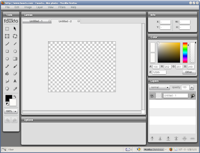
Fauxto...like photo

It's like Photoshop in your browser.
Well - not just yet but it is more than worth a visit.
Still Beta (as everything is nowadays), it offers more than enough options to get creative.
Signing up is mandatory though, but that just takes a minute - and after you've done that, you're all good to go.
You can upload jpeg, png, gif, bmp, and tiff from your computer, from a URL or use one of the photos available on Fauxto.
Some of the possibilities are
- add layers
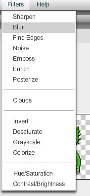
- apply filters (emboss, add noise, colorize, posterize, blur, noise, ...
- start from scratch
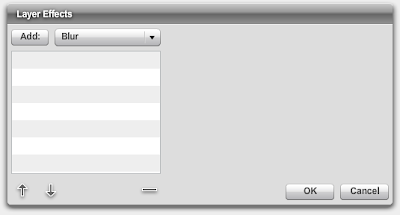
- layer effects
These are pretty much basic things and sadly enough some of the filters (like emboss) are just 'click and go', so you can't change the settings.
Some screenshots:


All in all more than worth a visit, but in my opinion only usefull when you don't have access to one of your regulal desktop graphic software.
Visit Fauxto
Posted by
THC
at
1:34 AM
0
comments
![]()
Labels: online
Tuesday, May 01, 2007
WIP : bumble dude
Work In Progress:
I just wanted to show off my latest and actually first real project I'm working on.
So far it's in it's early stages because the the idea is to give it a body and more bee-like features.
But I'm quit happy with the head at this point - although the shading needs a bit more tweaking.
Your thoughts are more than welcome.
Posted by
THC
at
8:15 AM
0
comments
![]()
Labels: photoshop
Sunday, April 29, 2007
Wallpaper with a sleek mirrored pictureframe
First of all, the focus of this tutorial is to show you how to create a unique looking pictureframe. I chose to turn it in to a wallpaper because I'm sure a lot of people won't know what I'm talking about when I say 'Create a sleek looking pictureframe for your Deviant ID'.
Examples of what you can use this tutorial for are avatars, (yup) a Deviant ID or cd-covers to go with your iTunes or Windows Media Player.
Be creative!
You'll need Photoshop CS2 for this Tutorial
- open a new file of 1024x768px and fill it with black
- create a new layer (name it "picframe"), select your Elliptical Marquee Tool and create a square with a fixed size of 250x250px
- Fill this square with black, go to 'Layer' > 'Layer Style' and change the following settings:
- Open up the picture you want to place inside the picframe and resize it to 240x240px
- name this layer 'photo' and center it inside the picframe layer. When you've done this hold down Ctrl and click on the 'picframe' layer and the 'photo' layer in the Layer window
- Right-click and select 'Merge layers'
- Create a new layer (name='top glass') and make a square of 238x238px with the 'Rectangular Marquee Tool'
- Center it inside your photo
- Select the 'Eliptical Marquee Tool' and while holding down 'Shift' draw out a selection as shown in the screenshot:
This leaves you with the following result:
- Fill this selection with white and set the Opacity of the layer to 30%
- Create an new layer (name='bottom light") again and draw out a rectangle (Rectangular Marquee Tool) with a fixed size of 238x120px
- Get your 'Gradient Tool' out with a 'white to transparant' gradient and draw out a straight line from the bottom of the selection to the top of the selection.
- Set the opacity of this layer to 20%
- This is what it should look like by now (zoomed in on picframe):
- Hold Ctrl down and click on the 'bottom light', 'top glass' and 'photo' layer in your layers window
- Right-click and select' Merge Layers'
- Right click on this new merged layer and select 'Duplicate Layer' (or drag the layer to the 'new layer' icon at the bottom of your Layer window)
- With this copied layer active, go to 'Edit' > 'Transform' and give it a vertical Flip
- Select your 'Move Tool' and drag the layer down to just underneath the original layer, leaving just a thin space between the two pictures (see screenshot):
- Create a new layer, take out your pencil tool with a size of 2px and #585858 as the color and draw out a straight horizontal line over the full length of the file
- Drag this 'line' layer just above the original 'background' layer so that it's behind the two other photo layers (see screenshot)
- Select the 'Magic Wand' and click underneath the line
- Create (yup - you guessed it!) another layer (name='white gradient') and, with the selection still active, apply a gradient ('white to transparant') from the top of the selection to the bottom of it
- Set the opacity to 40% on this layer
- Keep the selection active, create a new layer (name='black gradient') move it all the way to the top of the layers and apply a black gradient from the bottom of the selection to the top of it
- You probably have to repeat this gradient 5 to 6 times to get the right result
- This is what you should have by now:
- Guess what...you have to create a new layer (name='backlight')
- Select a 'Soft Mechanical Brush' with a size of 500px and white as the foreground color
- Click once with your brush on the 'backlight' layer giving you a nice white glow.
- Place this layer right above the 'white gradient' and 'line' layer, centered behind your original photo layer (the non-mirrored one)
- Go to 'Filter' > 'Blur' and apply a Gaussian Blur of 50pixels
- Next (and this is optional) duplicate your background layer, go to Filter > Render > Lighting Effects and channge the following settings:
(it even might look better if you apply the same lighting effect twice - experiment with it a bit)
After applying some text, mirrored the same way as I did with the pictureframe, this is the final result:
Click here for the Full-Size wallpaper.
Posted by
THC
at
1:10 PM
3
comments
![]()
Labels: photoshop
VirtualDub Mod Icon

Yet another fine piece of software that has an outdated icon, so I did my best on creating a custom one.
You can donload it here.
Posted by
THC
at
2:23 AM
0
comments
![]()
Labels: icons
Saturday, April 21, 2007
SnapShots now available through KlipFolio
I'm proud to announce that it is now possible to stay up-to-date on SnapShots through Klipfolio.
For those of you that don't know what klipfolio is: Have a look at their mainpage.
Already got KlipFolio?
click on the image below to add the SnapShots klip:
Or you can click on the Klip icon at the top of the sidebar.
Posted by
THC
at
11:16 AM
0
comments
![]()
RSS icons
Posted by
THC
at
4:31 AM
0
comments
![]()
Labels: icons
Sunday, April 15, 2007
Create a Speechbubble in illustrator
- Open a new file (any size you want), select the Ellipse Tool and draw out an ellipse with White as the Fill color and No color for the stroke
- Get the Pen Tool out and draw a triangle (Fill: white - Stroke: None) as shown below (make sure that it's proportional to the ellipse you just created)
- Go to Object > Transform > Rotate and rotate it with -20%
- Move the triangle you just created in to the Ellips as shown below:
- Go to 'Window' and check 'Pathfinder'
- Make sure you have both the ellipse and the triangle selected and click the 'Add to Shape Area' icon in the Pathfinder window
Both are now merged together
- Go to Effect > Stylize > Inner glow and change the following settings:
The color used is #CBECF4
This is what you should have so far:
- Select the Ellipse Tool again and draw out an ellipse (Fill: White - Stroke: None) as shown in the screenshot
- Next, go to Effect > Warp and give the newly created ellipse an 'Arc' warp with a bend of 15%
- Move it down a little bit so that it fits back in to the speechbubble
- Make sure the warped ellipse is still selected and give it an opacity of 50%
Now the final touch...
- Select the Speechbubble and change the stroke to #B7DCE2
All Done!
Posted by
THC
at
3:55 AM
2
comments
![]()
Labels: illustrator
Saturday, April 14, 2007
MediaPlayer Icon
The idea was to make an icon that could fit any mediaplayer.
I guess I managed that - but you can use it for whatever you like really.
Sizes:
------
16x16 to 256x256
Download
Posted by
THC
at
5:57 PM
0
comments
![]()
Labels: icons
Create an eightball in CS2
- Open up a new file of 512x512px (it's always better to start of bigger than the size you're actually going for)
- Select the Ellips Tool and create a circle with a fixed size of 300x300px (make sure your foreground color is set to black)
- Click once in your file and you'll see the black circle appear. Now center it with the move tool.
- Go to your layer window and right-click on the shape layer. Select 'Rasterize Layer'
- Select the Ellips Tool again and create a circle with a fixed size of 165x165px. Make sure your foreground is set to white and click once in your file
- Rasterize thez layer as you did with the big black circle and possition it as shown below:
- Create a new layer and name it 'top-light'
- With the Elliptical Marquee Tool draw out a circle as shown in the next screenshot:
- Select the Gradient Tool with a 'White to Transparent' style and draw a straight line from the top of the ellips to the bottom of it.
- This is what it should look like by:
- Create a new layer and name it 'bottom-light'
- With the Elliptical Marquee Tool, draw out a circle as shown in the screenshot:
- Select the black circle layer and click with the Magic Wand,while holding down Alt, on the white background inside the selection
- Go back to the 'bottom-light' layer (make sure your foreground color is set to white) and Select the Gradient Tool with a 'White to Transparent' style and draw a straight line from the bottom of the selection to the top of it.
- Go to Filter > Blur and select a Gaussian Blur of 26pixels
- This is what it should look like:
-Select the Text tool with a Georgia Font of 160pt and black as the Foreground Color.
- Press '8' on your keyboard and center the number inside the white circle.
- Also move the layer right underneath the 'top-light' layer.
- With the '8'layer still selected, go to Edit > Transform > Warp > and apply an 'Inflate' warp with a bend of 25%
- Next, select the Text tool with the 'Chiller' font (size: 160pt) and #f9b30b as the foreground color
- Type in 'eightball' (or whatever you want to type)
- Go to Layer > Layer Style and change the following settings:
Color used for the gradient is #ff0000
- After placing the text to an appropriate place, cropping and resizing, this is what the final result should look like:
Posted by
THC
at
6:08 AM
0
comments
![]()
Labels: photoshop


